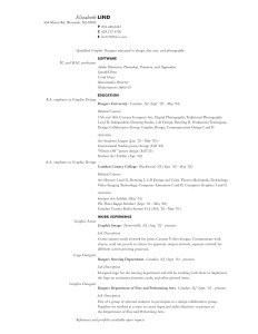
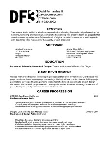
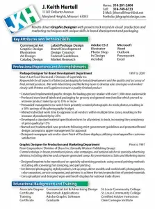
Make your resume stand out by using a beautiful design that most people have never seen before.
Here are some terrific resume ideas to inspire you.
You might want to bookmark this article and come back to it when you’re updating your resume. Enjoy!
Beautiful resume designs
 |
 |
 |
 |
 |
 |
 |
 |
 |
 |
 |
 |
 |
 |
 |
 |
 |
 |
 |
 |
 |
 |
 |
 |
 |
 |
 |
 |
 |
 |
 |
 |
 |
 |
 |
 |
 |
 |
Bonus designer alternative resume
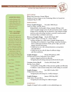
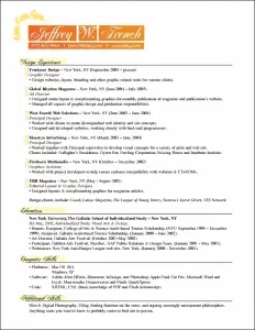
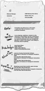
Although you would never send this to an Israeli diamond dealer or your local chick sexer, the mix of drawing and print on top of “the back of an envelope” really makes this resume (or curriculum vitae) memorable.
READ NEXT: 38 More Beautiful Resume Ideas That Work.
This article was part of Jacob Cass’s $5000+ Graphic Design Group Writing Project that I discovered on Group Writing Projects.
Resume looking good? Subscribe to JobMob via RSS or email and follow me on Twitter for more resume makeover pointers.

Pingback: $5000 Prize Giveaway Graphic Design Group Writing Project
A very original post, I have printed it for future reference… I need to do my resume again soon 🙂
Pingback: Graphic Design Articles
Pingback: Graphic Design Articles
definitely worth bookmarking and coming back to it during my next resume update – thanks so much for collecting them all here.
Very nice list. You got my bookmark! I especially like the black one but that may only work as a web resume.
Pingback: Really good-looking resumes by The Job Search Strategist
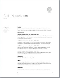
colin nederkoom is just a template from pages (from apple) not too original. the rest would truthfully get you rejected before an interview.
These resumes aren’t that snazzy… If I were an employer, I would throw these resumes in with the other junk ones without a second thought – except maybe the fourth one from the left down.
Just me $0.02.
If you’re a drudge fan: drudgetracker.com
As an employer I think it depends on the field in which you are applying. For a creative position for a younger person, some of these might be acceptable – but for a seasoned professional or corporate position many of these may give off the air that you are trying to “tart up” your experience.
Personally, I believe that a resume should reflect your personality, but not have to illustrate your personality. Most of these express “I think I’m gods gift to the world” or “I am self involved” or “I have never worked for a client, so I made my own logo using my name” rather than “I will work well in the established tone of your firm” or “my experience will compliment your firm”.
I would normally stay away from “name logos”, too much color/gradients, or arbitrary objects and rules – instead consider that a well designed resume is easy to read (especially for people over 40), has legible type (11pt and above), has clear content hierarchy, uses sparse typography (2 fonts maximum), and doesn’t overpower the information you are trying to convey with style. Remember, a resume is there to get you in the door, not be a replacement for an interview or portfolio.
I am a mature visual communication student and I am looking at my old CV which is three years old and it is putting me off applying for an intership. My previous work experience has nothing to do with the career I am looking for but if I leave them out will it not look like I have never worked before?
The whole point of a CV is to convince the reader to invite you for an interview.
Seemingly irrelevant experience can still help by showing achievement, ability to learn quickly, etc. (if it’s true) but the reality is that’s hard to change careers from the outside unless you arrive with a portfolio of personal work, volunteer experience, or something that will show you can do the job even if you don’t have actual work experience in the new profession.
More important is to put yourself in a position for success. Unless clearly stated in the description, internships are always aimed at students or recent grads. If that’s not you, spend your job search efforts elsewhere.
Thanks for sharing. Very interesting.
really interesting!!!
Hay tienen el mio http://www.felipedelpozo.es/CurriculumV5.pdf
Considering that many resumes are now emailed (and most then printed), colors or graphics that exceed the print margins will suddenly look very unprofessional. It must also be considered how your resume will look in black and white.
After scrolling through these, I find Kevin Fox’s resume is the best design in terms of a unique, eye-catching layout that still maintains a good text-only, no BS approach. Those with the colors and logos strike me as 31 different flavors of the same brand of bubblegum. Fox’s resume is scannable, which is good for someone seeking a techincal or IT position, which he is. I give it big pluses for being able to target certain keywords and accomplishments in the right hand column without the use of extraneous formatting and marks such as bullet points or Wingdings which only distract. Good use of available space. In my opinion, a very nice job that reflects a competent, no-nonsense kind of person who values a balanced blend of style AND substance.
i don’t like them.
I want simple, no eye catching gimmicks.
As a manager, any eye catching resume’s will be tossed out.
On Christopher McAdam’s resume he misspelled Excel.
I’ve had a few CV’s on my desk over the years and while these look great, why do I need to know your address? You have objectives? Great but I’m not interested. Beautiful layout… well by the time your recruitment consultant has sent it to me, it will be a mess. I’m going to give your CV sixty seconds, make the important parts stand out.
Moral of this story: keep it clean, keep it simple and definitely two pages or less.
Sixty Seconds. Do you subscribe to the 6 second rule many experts talk about or do you read the entire CV. ?
Pingback: Cowboy Caleb – 36 Beautiful Resume Ideas That Work
I think mine looks pretty good too!
http://aendirect.com/AEN_CV08.pdf
I make very good money, and from looking at some of the comments here by so called “employers”, I’d say what they are trying to say is, “Dumb down your resume’ because I’m a lazy arse bum and I don’t want to have to go through the hassle of selecting the RIGHT employee by actually having to READ it. I just want to find one that’s close enough to keep me out of a sling if my boss comes looking.”
Pathetic American employers. Get off your butt and do your job you bums. Effing Donald Trump syndrome. If you worked for me, with comments like I see here, YOU would be looking for a job in a short while.
Pingback: links for 2008-03-06 « Listening Matters
Pingback: Daily Links: Food, Money, and Resumes ? Get Rich Slowly
Nice Post. Some of these were really cool, but some were just terrible. Im not sure who was the judge of ‘beautiful,’ but there was alot of bad design. But the good ones were really good, so great post.
Ben – you have it right on – Skip – keep smoking, buddy. And don’t worry, I’ll smoke one with you and tell you you are dead wrong to your face. As a hiring manager (note – not an employer) I receive approximately 50-75 resumes a day. Only 45 minutes of my day, at max, is dedicated to reviewing resumes. Do the math. You have 10 seconds to make me want to read more, otherwise your resume is getting round filed.
I need to know IMMEDIATELY what your SKILLS are. Not an expression of your personality. Not a cooky attempt to get my attention. Most of those go straight in the trash. Do two things – present your skills up front. Make me want to read more. Then, back up your skills with demonstrated performance.
It is that simple.
Pingback: Daily Links: Food, Money, and Resumes | Medij.com blog
Pingback: links for 2008-03-06 « Mandarine
Pingback: 36 Belos Exemplos de Currículo | RuanWeb
Pingback: Tech interview questions » 30 beautiful resumes
Nice list – some of these are really nice. Great for getting those creative juices flowing! Thanks.
Pingback: Michael Gowin’s Blog » Beautiful Resume Designs
Pingback: Results from Jacob Cass’s $5000+ Graphic Design Group Writing Project } Group Writing Projects
These look great!
Neat post. I think that managers in most industries are looking for resumes that follow conventions. Creating extra stylization seems somewhat risky to me.
Pingback: Links voor 06-03-2008 | lodderig oog
Pingback: 36 curriculums chulos y efectivos
Pingback: /etc/system » Blog Archives » How to make your hiring manager cry
I didn’t know resumes were supposed to look like web-designs. Some were good, some were awful (the black one, for example – reminds me of liquorice gone bad).
Pingback: links for 2008-03-07 | KevinDonahue.com
Pingback: t-orienta.info » links for 2008-03-07
Pingback: links for 2008-03-07 en newdisco
Pingback: Bookmarks for March 4th through March 7th | noahcarter.com
Here is my Resume but I have to say that design is not mine.
href=”http://www.wow-central.net/CV/Romuald.BERNARD/
I have only used HTML/CSS markup language.
Pingback: links for 2008-03-07 « Worldtoplinks
I’m not an employer or a hiring manager but i have sent a lot of CV in the last few years with quite good results and I can see that these are not good at best. Some waste the most valuable real estate of the page, others will look rubbish when printed and most will be too unconventional. Also, I imagine that different versions of MS Word will wreck formating.
If you are looking for CV hints and tips take this post with a massive pinch of salt and write a traditional 2 page CV with the most relevant information in the top thirds of the pages.
I actually think these look quite nice–but my GOD do these designers need to learn to write. Spelling errors, run-on sentences and other garbage on such a pretty face..
Pingback: Link notes dal 5 3 2008 al 8 3 2008 » Sapientone
Most of these are awful – excessive graphics, fancy layout for the sake of layout, etc. But the simpler ones are very good.
An effective resume is one page, laid out for fast easy reading, and written with due attention to the five rules of effective editing: Cut, cut, cut, cut, and of course, cut.
What a wow post. I really think that managers in most industries are looking for resumes that follow conventions. Creating extra stylization seems somewhat helping to me.
this is just style over substance. employers dont have time for this sort of thing and it wont get you any greater chance of employment..
Pingback: Social Media Links of the Day: Sunday March 9, 2008 | Eric Lander's Blog
I get resumes almost every day and none of them have ever looked as good as any of those nice examples.
Well, I never thought I’d say that but I am really glad, my hiring manageres are open-minded, because it does not seem so around here…
They understood that a paper resume is one thing and an online resume is another. Think about it before telling us how to make a resume.
its really help full to all . and its really intresting and new
I hate resumes.
Fresh Idea. If I were applying to a record label, art gallery, or porn store, I would consider using this type of format. Otherwise, just stick to black and white, and focus on making something that is cohesive and easy to read. These are distracting, in my opinion.
As a business owner myself, and having spent large amounts of time in the past with resume experts, I found only 9 of the 36 resumes above to be even worth a second glance.
Here are the best tips that I can give to help anyone that happens across my post.
#1 – Have plenty of white space. Margins are your friend, they make your paragraphs seem shorter, and put less strain on the reader’s eye.
#2 – Keep the changes in font style to a minimum, only bold or italicize things that are important. The general rule in almost any print medium is 3 font style changes per print. Basically, choose a font and stick with it.
#3 – Get rid of the “design features”. These are all well and good when you are creating a poster, but these “design features” distract the person from the content, and will often lead to your resume being filed away. If you are in a design field, feel free to add something to it, but make sure it doesn’t distract. Ryan Gilden did rather well keeping his designs in the background from distracting from the text.
#4 – Bullet points are your friend. This is especially important in large companies that receive hundreds upon hundreds of resumes per year. Use bullet points liberally, often a couple words will do better than an entire sentance. Many of the larger companies out there don’t even read the resumes anymore, opting for a resume management system, and managers will often search by keywords.
#5 – Keep your contact information in one spot. I noticed on a couple of these they had their address in one spot, and their phone number in another. Keep them both in one spot, because it is easier to find the information, and many of the resume management systems will try to automatically pick out this information, but they have problems with the info being all over the place (or even vertically along the side).
Lastly, if you hand it to someone you don’t know, and after 10 seconds of looking at it, they don’t have any idea what your education, experience, qualifications, or even your name are, have fun even getting an interview.
Peace out, and good luck.
Pingback: 36 Beautiful Resume Ideas That Work | Most Inspired Blog
I am not sure if I am in favor of all of the resumes, I do like to see more creative, out of the box ideas, I don’t like the designs that use black or other colours as the background. I do like the first one, with the vector of himself at the top. Also another good take from this post is the use of typography. Good post
Interesting Design.. this is perfect list
Inspirational stuff – These look excellent.
Lets hope these put a stop to the awful MS word templates!
ha ha
Simon Dance
Pingback: Lifehack Digest for March 14 - Lifehack.org
This is all well and good but have you noticed that most of these won’t work very well as MSWord Attachments?
I really don’t know any employer who requests PDF files.
Pingback: Model C.V. | DaLinku.ro
Pingback: Dave’s Messy Desk » Blog Archive » Beautiful Resumes
Pingback: Daily Links | Akkam's Razor
As someone who has hired my fair share of folks, I have to say that there is truth in both sides of the argument raging here. First of all, a good-looking resume will get my attention. BUT if it has typos, misspellings and/or is manifestly missing the key skills I’m looking for, it will get set aside. Second, at least in the fields where I’ve worked, the cover letter is more important than the resume. If the cover letter does not convey the writing skills, the personality, and the qualifications of the candidate, I won’t even look at the resume. Third, I think there is some validity to the point that these will work better in some fields (web and graphic design, for example) than others. But fourth and finally, anyone on this discussion who sets aside a resume because it’s to cute or graphically intensive is an idiot — I want to hire people with personality, brains, and spirit. A fancy resume design may not guarantee that, but it is going to get my attention.
Pingback: Cele mai frumoase 36 de modele de CV | PCNews
Pingback: Odnal - Building wealth, bit by bit » Blog Archive » Finally all caught up
BigMatt,
If you are personally doing 50-75 resumes per day I’d fire you for being inefficient. You can’t bring in good people because you can’t dedicate the time to actually look for them. You should have had a resume management method in place ages ago. Your a buffoon making fun of people that actually have intelligence.
Have fun wallowing in your stupidity while you and your alter ego Ben are both swallowed up by companies using their resources wisely.
Charlie is dead on.
I don’t find these to be the best resumes I’ve seen either but your comments make me KNOW I would never hire you nor work for you. I’ve turned employers down cold after meeting them. I’ve told them they have wasted my time to their face. I’ve been asked back by more than one for a second chance to get me to work for them.
You’re clueless.
Pingback: 36 Beautiful Resume Ideas That Work
Pingback: This weeks ‘marks come with Paddys day cheers | Kristin Pishdadi
Pingback: 36 Beautiful Resume Ideas That Work | JobMob
Pingback: Gene’s Blog :: 36 Beautiful Resume Ideas That Work
Pingback: ?????36+???? | ??
Pingback: Monday morning links serving: The March 17th edition
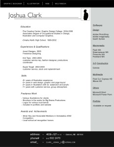
In my opinion, Joshua Clark’s resume is very tasteful. It has an eye-catching layout, with minimum use of graphics. In other words, it stands out from the typical resume without looking like a picasso painting.
Can someone please tell me how to replicate this layout? i.e. the text and the bars in the top black box, the side column etc…
Thank you
why does when i try to click on kevin fox’s CV a warning from my avast scanner about stopping a malware? am i the only one who gets this message?
Great to see a lot of buzz around your article, Jacob. Nice work.
Pingback: Some links « Jen’s Blog
Pingback: Checklist I Used To Hit #1 on del.icio.us } Group Writing Projects
Pingback: DennisDeery.com
Take a look at my resume story which includes my sample docs towards the bottom. Changing your resume can make all the difference in your job search.
Pingback: CV jak si? patrzy! | design-in' / graphic designer's blog
Pingback: 36 modelos de curriculums gratis | Mi ETF.com
Pingback: Bookmarks for Thursday, March 27th — Trevor Fitzgerald
While I do appreciate the effort made in the design, I agree with a comment above that the substance does matter. Case in point: several of these resumes have obvious typos that a spellcheck would have caught. “Compliement” and “embriodery” are two that jumped out at me.
Pingback: Magic Multi-Inspirational Sites of March | Malene Hald
Wow!! Realy nice Resumes. Want more….
Pingback: The photojournalism resume | Waitin' On a Moment - by Tim Gruber
Pingback: 36 Beautiful Resume Ideas That Work | Prajwal Tuladhar's Blog
Pingback: Link: CV Appearence « All Wrong
Pingback: Bons modèles de cv « Ma carrière en TI
Pingback: Revue de presse | Simple Entrepreneur
Pingback: Comment présenter un CV ? by Capital Engineering : Le blog.
it realy works – so use this ideas !
????? ???? ??????? ????? ???? – ??? ????? ????? ?????? ????? ????? ???? ??????? ???.
Pingback: Sunday Linky Love | The Bean Blog
Pingback: Bookmarks for Monday, April 7th — Trevor Fitzgerald
I love how these recruiters on here act so busy and that they have only a few minutes of their blessed day to look at resumes.
It’s no wonder I hang up on you clowns when you call me with your terrible 4 month contract jobs paying a third of my hourly rate 200 miles away, to practice a skill I’ve never used.
IF you want to pick up the phone to call me at work, take the time to read my resume or expect to get tooled on…
WARNING: The “Kevin Fox” resume contains a VIRUS!
Found by AVG!
These really aren’t all that amazing. Some were great examples, but they’re shining examples in a pile of mud.
I do appreciate the comments from recruiters and hiring managers, however.
Pingback: Designing Your Résumé (CV) - Some Links » Lloyd Morgan
What do you people want from a resume? It’s an open style document! The guys writting it can do whatever they want. Colour, images, charts, tables, creativity. You want only the information, ask them to fill out forms. You’ll obligate them to fill only the information you want, on a default template, perhaps even using some small computer system, like many software companies do. No graphics. No colours. No diversions. Just plain text. But, as long as you accept Word-based resumes, get used to this because you’ll see it a lot!
Pingback: tonyocruz.com » Blog Archive » Really great resume designs
Pingback: Chris Carlson » links for 2008-04-26
Pingback: Father Sez » Archive » How I intend to help my daughters secure jobs they would like – Part 5 – Preparing a Killer Resume
Excellent! I actually used the one at the top-most right-hand corner and landed a job!
I think if you show you put some thought into your resume, employers do take notice.
These are nifty. I think a lot of Gen X managers and particularly Gen Ys would go for these.
These resume designs are beautiful. Can these be done in regular microsoft word or does it require some graphics program like adobe illustrator?
i am thinking the same thing as #108
thank you for ur seening me this bages .
really i like agood and and beutifull,styler cv so help me
Kool article man..keep it up
What this article is pointing out is the beauty of the resumes not the content. If you read most of them, these are inexperienced people, some still finishing up their educations, and vying for an employer’s attention. When you get to a level where you don’t need to put where you slung coffee, waited tables or had a stock-room gig, design is secondary. That’s why many employers don’t care for the design side, they’re interested in the experience. Cut some slack to these newbies, there’s nothing wrong with an attractive resume, but there’s a balance/limit for sure. Less is more?
hey,
nice resumes – can someone share Microsoft Word Template of these Resume? It’ll be great.
Pingback: Top Posts of April 2008 | JobMob
Wow, good thing I’m doing my research. These look way better than the resume I did in notepad.
these are great but where do i get the templates to make them my own?
Pingback: Innovative Graphic Design Resume CV and Portfolio Tips
Pingback: Father Sez » Archive » Thank God, my two elder girls have secured their first jobs
Pingback: The Best Graphic Design Articles from 34 Top Design Blogs as Chosen By The Authors Themselves | Dalton Trent's Blog
Great collection of resumes here. I like the fact that the majority of them are still somewhat standard in the fact that the designer realizes that resumes still get faxed, copied, or printed in BW for HR departments. Finding a monochromatic balance with a color scheme is awesome!
Pingback: Graphic design jobs in Ireland « Design Secrets
Bookmarked. Could of hosted them on your website or image hosting website, some of them don’t work now 🙁
Pingback: 38 More Beautiful Resumes That Work | JobMob
Pingback: 38 resume ideas « Career Solutions’s Weblog
Hi everyone,
First off- overdue congratulations to Ben. Way to go!
I’ve just posted a new list of beautiful resumes here:
38 More Beautiful Resume Ideas That Work
Chris- I didn’t realize that some of the links had broken over time, but they’re fixed now. Thanks for pointing it out.
Affordable Web Design- designers are lucky in that it’s so easy for them to demonstrate their skills (or lack thereof). And you’re right, it takes a smart designer to make a color CV that prints well in black & white.
jennifer, alee- I hope you’re following JobMob, there should be some information about great templates coming.
prelox, /greenpeace – most if not all can be done in Microsoft Word, but the images would still need to be created using another program like Photoshop or the free paint.net or the fantastic but harder-to-use GIMP.
Regarding the whole ‘do these work?’ debate- there were lots of terrific comments on both sides and I thank you all.
The most important lesson to take away is that you need to determine what will work for *YOU* by trying different things because what works for one candidate/recruiter may not work for another candidate/recruiter, even in similar context or industries. Use these resumes to get inspired. As Nedsferatu found out (thanks for sharing!), a bad resume can be the only thing preventing you from your next job.
Thank you for fixing the links, Jacob. Much appreciated. Great post.
Nothing better than creative resume, great work in putting this together, thanks!
These are all well and good ideas creating a resume, but these design features attract the person. The collection of resumes are very beautiful. It will be very useful for me. thank you
Didn’t see the link to 38 More Beautiful Resume Ideas That Work, until now. Just going to check it out now. 🙂
//jobmob.co.il/blog/more-beautiful-resume-ideas-that-work/
Pingback: Presenting your CV with style … | [EV +/-] Exposure Compensation
Pingback: Resumes That Work at A Ghost of Daisies
Pingback: Rebuttal: Why You Do Need a Beautiful Resume | JobMob
what types of font does Karla Martinez use?
Pingback: Intro to the Graphic Arts - GRA 217 - Professor Ken Harper » Blog Archive » Second class - Project 1
cs- if you click on the CV, you can see a bigger version with her email address. Why don’t you ask her?
It’s fine. I’ve figured it out. Its Helvetica.
Pingback: 36 Ideas para tu Currículum | Vaquelita
Pingback: 74 Originales diseños para tu Currículum | Marcelo Vega
Pingback: Empurra com Água» Blog Archive » Links da madrugada
Pingback: links for 2008-08-19
Pingback: interact » Blog Archive » Make your résumé reflect your talent… visually
Pingback: 29+ sites for resume inspiration and cover letter writing | Will Sullivan's website. Journerdism
Pingback: links for 2008-10-09 « Where Is All This Leading To?
Pingback: ?????? ?????????? — ?????.??
i found very nice resume in your website!
@Laura_Siebert Yeah, I’ve finished the text and now I’m just messing with the format. I found some neat models at http://bit.ly/sQKH
Resumes are nothing more than a pack of lies and exaggerations. People using grandiose terms to describe simple tasks. An employer hiring from “facts” on a resume will always be disappointed when their employee eventually turns out to be someone different than they hired. A good resume should convey a persons personality. So design is everything. If you’re a funny person… be funny. If you’re an artistic person… be artistic. If you’re a simple person… be simple. Make it yours. Give your potential employer the help they need to find the right fit for the position they’re trying to fill.
http://tinyurl.com/yw9jrv
36 Beautiful Resume Ideas That Work | JobMob
Loved the different beautiful Resumes. Awesome
Looking to upgrade your resume but wanna stand out from the crowd?
http://tinyurl.com/yw9jrv
Pingback: Class Assignment for the week of 11/17/08
As art, these are beautiful resumes. I would hang some on my wall.
As resumes, these are simply not workable. Not only would most be pitched right away (as some have said), they are impossible to import into the scanning devices that 99% of employers use now to scan through them.
I’m seriously amazed and disappointed in a lot of the childish comments on this thread, though. I guess creating great art is much more important than creating a career which both gives you nourishment of the soul and nourishment of the dinner plate.
There are a few nice examples here, but most of them are downright painful. Why did you choose to showcase 36?
Adam- 36 isn’t a number that you often see in blog titles, and it was big enough to attract attention.
Pingback: links for November 13th through November 15th | Jared Silfies
Pingback: Twitter Link Round Up — crowdSPRING Blog
Pingback: A vossa marca: CVs, dicas e recursos | Your brand: CVs,resumes, tips and resources « O Lago | The Lake
Pingback: The 25 Most Creative Designer Resumes You’ll See This Year | JobMob
If the looks of a resume were the only thing that got interviews, you would have the market cornered. Great stuff.
Jay
Nice
Some nice designs.. I’ll give you that..
but, have your considered maintenance?
what happens then eh?
what about portability?
can your cv be read by bots?
agents are lazy, make it easy for them to find and pinpoint your skills
support microformats such as hresume in your online cv/resume.
Also have a nice design.
best, Ant
Pingback: Top 10 Most Beautiful Resumes of 2008 | JobMob
Pingback: Blog Safari :: Readers’ Best Posts of 2008 - Postcards from the Funny Farm
Pingback: Girl Meets Business | How to Rock Your Résumé
Pingback: Jonathan Benoudiz ’s Blog | Fourre-tout
Download format of the future on the following link:
http://rapidshare.com/files/181217317/CV_PPerez.pdf.html
Your comments curriculummultimedia@hotmail.com
Thank you
Someone mentioned that most resumes are submitted via email now, and that’s true. In order to keep your design intact and have it come across the HR desk as intended, submit it as a PDF. Just a thought for anyone who is determined to include graphics on their resume.
Ant, Anne- good insight and tips, thanks for that.
Pingback: Prompt for Blog Post 1 « ENGL 391 1202 Class Blog
Pingback: Prompt for Blog Post 1 « My Blog
I’m in the process of revising my resume now, some of these are going to give me some great layout ideas. Very helpful!
Pingback: some more good resumes | Intro to the Graphic Arts - GRA 217 - Professor Ken Harper
Pingback: JOB ANGELS On Twitter! And Twittering To Barack Obama About Helping the Jobless Find Jobs (With Great Job Resources) « The Daily Bitch
Awesome collections i must commend da Mobb_its a truly a Beautiful Collection of Resume that Works! Big Ups to You – Helpful Concepts to other Designers…
Pingback: Como hacer un curriculum | Descargar Online Gratis
Pingback: makemassair .blog / resume design ideas.
Great idea for printed resumes. However, a lot of companies are requesting that you cut and paste a plan text resume into their job site.
These graphics and great ideas. But, wouldn’t help in this digital posting situation.
Maybe there’s a way to stand out from the crowd using the digital cut and paste.
Please forward any ideas of gpjanke@ gmail.com
For those of you who are making the point that these resumes may look beautiful but cannot be submitted digitally, you are missing the exercise. These resumes are intended to be seen by design professionals either on paper or PDF format. They are not intended to be processed by HR for accounting jobs. That is why they are “designed”. Many of the people who submitted these made very deliberate choices about the paper they would be printed on and the people they would send them to. They are not intended to be posted on Monster.com and if they are they are looking for the wrong jobs.
Pingback: Curriculum Vitae Extraordinär | soppa på en spik!
Awesome list here. Thank you VERY MUCH! I need to change my crappy Word-based resume.
These are cool, i am trying to update my resume now. what programs are needed to do this kind of design..thank you for your time.
Tp.
Pingback: links for 2009-03-09 « doug - off the record
Tony P- most, if not all, of these resumes were designed by graphic designers who are very handy with programs like Photoshop, Illustrator and other design and page layout software. That said, you could use freeware like Gimp or Paint.NET to do the layout elements and then import the images into Microsoft Word or OpenOffice.
Pingback: Protean Circuit | Ranstrom.se Blog » Blog Archive » Resources for the resume writer
Pingback: Cool Resume Ideas | Remarkable Things
Pingback: Comment faire un beau CV - partie 1 | [Ré]créations graphiques
Your resume needs a revamp? Try this site for some great ideas: //jobmob.co.il/blog/beautiful-resume-ideas-that-work/
Pingback: How To Get the Summer Internship or Job of your Dreams | Bryan Connor
Awesome man!
found cool creative resumes http://tinyurl.com/yw9jrv
Pingback: not a polish blog
@itsjeremy Thanks, at the moment I’m thinking design more than content. I just found this which is helpful designwise http://bit.ly/sQKH
I’ll have to go with Andre Morgan’s template. It’s a bit modern yet retains the professional feel on it with comprehensive structure. Very nice to read if you’re an HR of a company or a recruiter.
Pingback: Resumes, resumes, resumes… @ Castillo’s CrashPad
Pingback: Un esempio di Curriculum Vitae con template scaricabile | PV.M Garage
How come you didn’t make them downloadable?
Dee – I never thought of it. Why bother? People can just bookmark the article and use it as a reference.
Pingback: A Good Curriculum Vitae Example with Free AI Template | PV.M Garage
As a professional resume writer, I love it when I have a client in an industry that allows a really ‘fun’ look. However, the look of the resume can NOT get in the way of the content of the resume! The design or color should be enough to catch the eye, but not so much you think a 4 year old got at it with a crayon! Generally speaking high profile, executive type positions do not work well with much color or design. Where as a chef or interior designer has more leeway in the creative element. Your resume text should be in a clear, clean, easy to read font and format.
If you have a beautiful resume, but no one can read it, all you have is a beautiful piece of paper and a quiet phone.
3 year old resume (guilty) in need of inspiration? http://bit.ly/sQKH + http://bit.ly/yfci + http://bit.ly/nVfa + http://bit.ly/9OQQ
Beautiful Resume Ideas: http://bit.ly/sQKH and http://bit.ly/yfci *LOVE* skills evaluation with stars!
These are definitely interesting resume ideas. But most of them look like they’d only work for those looking for creative types of jobs.
36 beautiful resume design ideas http://bit.ly/sQKH
Unique resume ideas… http://tinyurl.com/yw9jrv
Those are excellent. I think for a designer it is quite a must to have such a resume.
Pingback: 36 Beautiful Resume Ideas That Work | JobMob « VilComp's Blog
PURPOSE: RT @jacobshare 36 Beautiful Resume Ideas That Work | JobMob http://is.gd/94Uu
Simply excellent post on alternate resumes http://bit.ly/sQKH
Pingback: Job Hunting « Penny's Coffee Klatch
Pingback: Emily Ingram » Week 4: Put up your resume in HTML and PDF formats
Pingback: MyWorkster Blog » Blog Archive » Getting Creative with Your Resume
..y si estáis sin inspiración para “retocar” vuestro CV, un par de enlaces: http://bit.ly/sQKH y http://bit.ly/4nsaoY , espero que sirvan!
Pingback: Com presentar un Curriculum « Weblog SPIRA Comunicació
Resumes are important, but only part of the sales package. Consider creating a blog and a video resume to help you stand out from the crowd. Doing something creative, yet conveying your message in a way that is easy for your audience to understand will help slant the playing field in your favor.
Pingback: 123 Beautiful Personal Logos, Monograms and Wordmarks For Your Inspiration | JobMob
Pingback: Resume complete! « Zahra Langford
Pingback: My resumé | gyaresu.org
36 Beautiful Resume Ideas That Work | JobMob http://is.gd/94Uu
Pingback: Mina Lash
Pingback: Josh Miley
Pingback: Fleet Brian
Pingback: tigerfox
Pingback: Ckamixo
Pingback: M.F.Antunes
Pingback: Alda Telles
plz send nice format of resume
As an HR director and now resume writer I suggest people send a hard copy in a stand out format such as yours (in addition to emailing a resume.) While in HR if you got my attention – in a good way- you had a good chance of getting an interview.
please Send me to new Cv Design
Great design templates to make your #resume stand out from @jacobshare http://tinyurl.com/yw9jrv (via @site_news🙂
a good source to learn who to write and design a cv please add some more cv’s thanks
Pingback: Passional Gamer
I think Eggleston’s resume layout is neat and smart. I’d definitely book an interview the candidate with that kind of CV.
Pingback: 93 Most Popular Articles of Top Job Search and Career Blogs | JobMob
Pingback: JodieCantu
To comment 17, you’re crazy, there’s absolutely nothing wrong with an eye catching resume! It shows that they put time and effort into their work (granted they can retain substance as well).
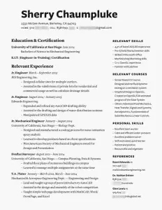
I think the first resume idea is definitely an eyecatcher, how often do you see faces on resumes???
So, if resumes are to be simple black and white text to be easily readable, what can you do to make your qualifications, skills and training stand out in a sea of times new roman? Is the answer that something special is ok as long as its not too much or distracting from the content?
Pingback: The Résumé, Part 2 « Stop Collecting Unemployment, Start Here
Pas mal ! RT @Korben: Des modèles de CV pour vous inspirer //jobmob.co.il/blog/beautiful-resume-ideas-that-work/
Pingback: CareersSocgen
Pingback: Un nouveau CV pour une nouvelle vie « TrAsKiN
The templates provided here are very good. This is a very beautiful idea.
Pingback: Sparkwood and 21 | 9 tips for a Better Résumé
@ sugarlump resume-ing it up. //jobmob.co.il/blog/beautiful-resume-ideas-that-work/
Pretty cool templates! I would say, always keep it simple unless you are in a creative industry…
.-= Jorgen Sundberg´s last blog article was Who Else Wants Perfect New Year’s Resolutions? =-.
Pingback: Using the Web to Find Writing and Editing Jobs | PoeWar
Wow, all of those people who said they don’t like any of these because they don’t conform to stuffy conventions are exactly the types of employers I don’t want to work for! What a great way to filter employers at the same time as applying for jobs!
Pingback: resume design ideas. | the blog of makemassair
Pingback: Make Your Resume Awesome! « GAU-CHÉ
Pingback: Personal Branding on your Resume Harrison M.
Pingback: Resume Design Showcase and Tips Round Up | Design-Notes
Pingback: Une petite tournante de liens et ressources #3 | Emmanuel de Taillac.fr
Pingback: Job Resources « kooljoy.com blog
Pingback: ATL's WordPress on atlphotography.net » Blog Archive » 36 Beautiful Resume Ideas That Work ?!?
Thanks for the inspiration!
They’ll only work if you’re trying to find employment in the creative sectors. Otherwise people will think you’re a freak! Can you imagine applying for middle management in a financial institution with any of the more eccentric CV’s attached here?
Pingback: Better safe than sorry… « Maundering Me
Pingback: Who Will Hire Me? Creating 21st-Century Résumés - The Learning Network Blog - NYTimes.com
Pingback: uberVU - social comments
Pingback: How do I write an effective Resume? « Classrooms to Cubicles
Wow. Really dissappointed with the narrow minded air in these comments. Most of the highly designed resumes here are for creative positions, particularly as graphic designers. Wouldn’t a plain, traditional resume from a graphic designer seem counter intuitive?? If you are looking for a job as an investment banker, don’t use anything but a plain, B&W resume. But if you are young, hip and creative, and looking for a job in the same, please ditch the bland, traditional resume. Apply common sense based on your skills and job target.
Hey, do you design personal resumes? I’d like you to design mine if possible.. just let me know your fees.. I need one ASAP. Just drop me an email and let me know what I have to do. I am in LOVE with your examples. They are amazing and I need my resume to POP since I have a lot of competition..
Thanks!
Aimee J Martin
aimee.j.martin@gmail.com
i dont understand why people are being so negative about these… theyre not peices of art, theyre all plain and simple and easy to read… just not the same as everyone elses. surely making an effort and having something different is a good thing?
Pingback: Job Search Experiment Episode 10: Resume Design | The Job Shopper
To Whom It May Concern;
I was wondering if there is any way I can download the sample resumes shown here (maybe as a template) to use with Microsoft Word?
I would obviously customize them to my individual preferences and not use them as given but it would be nice to have the ready-to-use (and alter) as templates.
I especially like the “Ryan Thomas” (black background) and “Sean David Coe.” I would really appreciate if those could be provided in template forms.
Yours most sincerely,
Baber Rahim
Baber Rahim- sorry but no, templates aren’t available for the above sample resumes.
Pingback: The 53 Best of the Best tips and to do’s While Unemployed | Thought 2 Profit
Pingback: How to find a Graphic Design job | Vincent DePalma
What program were these designed in?
how do get one of the designs to use?
how do get one of the designs to use?
Jk- standard graphic design programs like Adobe Photoshop or Illustrator for the imagery, which was then imported to Microsoft Word (for doc files), Adobe Acrobat (for PDF files), or similar.
Anna- we offer custom resume design services so you can have your own beautiful resume. Use our contact form to tell us if you’re interested.
Pingback: CV design | Resume Rescue
i need some one to help me on my resume for modeling
Pingback: Weborama #18
Could you give me a Word version of that?
Jennifer R- You can get Word versions for a fee. Please use the contact form to tell me if you’re interested and we’ll take it from there.
The formats are good. They look creative and fresh.
I liked the 5th one, the most.
Pingback: Blogging From All 50 States | UltraRob's Adventures
Pingback: Trendy Resume Samples - Beauty is in The Eye of the Employer
I like the designs of the resume, very creative and innovative ideas.
How to write the best resume and cover letters for entry-level and established jobseekers: free samples & templates of resumes & cover letters.
Pingback: El CV ha muerto, construye y aprende a mantener tu perfil laboral 2.0 | Un Cafelito a las Once - 1C11
I’ve got some advice on this topic, too. Mainly what not to do.
http://www.sparkedon.com/?p=19
Numero uno – your cover letter better be made out to the employer to whom it’s sent.
Pingback: 逸风的技术博客 » 小总结
Seems like a couple of years ago this site had some decent commentary, even if I don’t agree with much of it, but since then it’s become nothing more than an advertising blog. Folks, get this, the world has changed yet again and most employers don’t even call you back or even acknowledge they got your resume no matter what it looks like. The rules now are call by phone, call again, call back, even visit in person if you can, and then call back again. All the fluffy fancy pretty resume styles won’t get past the lazy, ignorant and uncaring hiring managers that have managed to hang on to their jobs while laying off everyone else. HR folk are now, in my opinion, bottom feeders, and in general do very little good for their companies. Most companies large enough to have HR staff use HR expertise mainly to avoid getting sued by laid off employees and comply with employment laws and nothng more. Just remember who gets blamed first when the wrong employee is hired or turns out bad … not the employee but the HR staff. Do you think THEY are going to trust THEIR precious little careers to someone with a resume that looks prettier than their’s ? Even if you have the skill set that a company needs it still doesn’t mean you will get hired; you might show up the person who will be your boss who’s also done nothing more stellar than to keep their own job. If your resume shows that you are more experienced and are more educated than the CEO then ciao baby! Looking back at the comments I find #21 by Skip says a lot of what I’ve reluctantly come to believe is the norm in industry today. Is there hope? I hope so, but if the future depends on ever more conformity then why even bother? Go out and set up a business of your own … make your own rules and do something the conformists say can’t be done. Happens every day. And when it does happen, gosh, the number of resumes that get sent to you is amazing. I’ve even had HR people apply to me for jobs – what a laugh!
Pingback: ecofield » El CV ha muerto, construye y aprende a mantener tu perfil laboral 2.0
Pingback: Twitter Link Round Up « crowdSPRING Blog
Pingback: Clase 11 de Villa Allende Grupo B,D y E « Alfabetización Informática
Pingback: Clase 10 de Villa el libertador « Alfabetización Informática
Just wanted to say that two years ago I found this page and borrowed some great design ideas for my application to an environmental job with a regional council in NZ. What I presented to them was definitely FAR more flashy and graphic heavy than a “standard” CV. Out of 130 applicants I was one of only three to get interviewed. I got the job and still work there. My manager told me that my resume leaped off the screen and that was what caught their attention… It was apparent to them that I had obviously spent the time to present myself. I think you absolutely have to use your discretion and contextualise your CV to the job you’re going for. But a unique design is what got me an interview, and that’s what we all want isn’t it?
KatieN- thank you very much for taking the time to come back and share your success story. Good for you!
These are some really nice (simple) resume designs.
Pingback: Job Hunting: Getting Noticed on Paper | Edging
These are really nice designs and with a well written resume that combo can really lead to great success.
Pingback: Sleek but Cool Resumé | INTRODUCTION TO THE GRAPHIC ARTS | Professor Ken Harper
Pingback: Resume Ideas | INTRODUCTION TO THE GRAPHIC ARTS | Professor Ken Harper
where to get these or any workable and good lucking resume templates
The bonus resume is awesome, but “proficient” is misspelled.
Pingback: Making a Creative Resume « The Creative Dork
I like them, very simple and sweet. Check out this one too! I think its pretty sweet as well.
http://www.jaesal.com/images/resume_jsalavarrieta.pdf
D’autres tuto disponobles ici :
http://www.viviencormier.fr/le-blog/article.php?id=47
++
Hi – that’s a really nice collection and I’m sure it will be really useful for some students. For designers looking for some extra advice, we have written a brief article for new designers on things to consider when applying for a job. You can view it here: graphic design career advice hopefully it might just help someone to get moving in the right directions.
Thanks for posting.
Pingback: PR Open Mic « Public Relations Writer
if my interesting cover letter or unique resume scare off employers that is fine. it means they don’t have an open atmosphere and are not encouraging of the creative process. i wouldn’t want to work there anyway. i love these resumes. thanks for posting.
Great designs – however as a professional cv and resume writer I would stress that the content of your cv needs to be as good if not better than the “design”.
As people have said, here are some great resume examples.
I do agree that you must use these as a starting point to create your own, after all you are unique, so should be your resume.
You need to communicate your flare and character as much as ability and value to the employer also.
Pingback: Komori Hiroko
Pingback: Komori Hiroko
Pingback: 鷲巣大輔
Pingback: 鷲巣大輔
Pingback: Komori Hiroko
Pingback: Komori Hiroko
Pingback: Mosaic XM and SM
Pingback: Mosaic XM and SM
Pingback: junko
Pingback: junko
Pingback: danny p
Pingback: danny p
Are any of these artists for hire or is a template available for purchase? Not a designer and really want my resume to like like these. Would need a quick turnaround though.
Pingback: HS for LECJ
Pingback: HS for LECJ
Pingback: 36 großartige Lebenslauf/ CV Vorlagen | emendatio
Pingback: Michael Del Camp
Pingback: Michael Del Camp
Pingback: Rajesh K
Its obvious there are a lot of old hiring managers commenting here. I’m an old guy myself, and I’ve hired for many positions. As long as the content is good, I see no reason not to dress it up. Why would you old farts be offended by some pleasing layouts? It’s likely you’re threatened by the creativity of these younger people. Better move aside and make way then
Pingback: Creative Resume Designs | INTRODUCTION TO THE GRAPHIC ARTS | Professor Ken Harper
Pingback: Jennifer
Pingback: Emily collard
Pingback: Chad McDaniel
Pingback: Esra Al
There’s a lot of good comments on both sides regarding these resumes. But I’d like to point out, that for a Designer’s resume to be well designed, it most certainly doesn’t need to have graphics, fancy typefaces or extreme layouts. Careful attention to typography, negative space and the relationship between headings and body copy can create a design resume that is both black and white and extremely handsome.
In my opinion, creating an attractive, professional, and well designed resume without graphics is very difficult – and is a sign of a very skilled designer.
Anyhow, if applying for a creative position, it’s not your resume that is supposed to showcase your skills – but rather your portfolio.
These resumes are great. Thought I would throw mine out there for praise, bashing or criticism. Here is a link to it :: http://stapleydesign.com/resume_2011.pdf
Thanks, Craig
Craig- good job on your resume’s design, it looks great. Spend more time mentioning specific successes, with numbers and/or sample graphics (almost a mini-portfolio).
THESE AR OK OH AND IM COMMENT 335
These are fantastic! I was told my resume needed “colour…and bold things…and different fonts!!” and was a little overwhelmed, but these designs were really inspiring. Thanks!
Pingback: Rethinking the Resume |
Pingback: Blog » New Resume: From Dull to Cool!
Pingback: un CV qu’ils me demandaient | Les z'ed
Plz Plz Plz post one of the best resume for me on my email, I must be really very thankful to you.
With regards
Bhat Nusrat
EXCELLENT,SUPERB IDEAS AND CONCEPTS WHO MADE THIS DIFFERENT TYPES RESUMES.
GOOD BYE…..
Pingback: Renita Wade
Pingback: Mary Koster
Pingback: Mike Calderwood
Pingback: PFRLLC
Pingback: Joanne Munro
Pingback: Diego Jiménez
Pingback: Erik Vossman
Pingback: ignitetechnical
Pingback: Kayla Robillard
Pingback: Chad McDaniel
Eye candy resumes. The resumes featured here seem to be for creative/designer type jobs. What about the not-so-hip entry-level bookkeeper or re-entering the work force person?
HR people pains me to hear/read that HR has no time to read resumes so that applicants have to make eye candy for them.
HR do your job. Read the resumes. Perfectly qualified people are being overlooked b/c their resumes aren’t blowing smoke up your holes. HR. What a joke. Fire HR.
Whatever man made HR rules need to be eliminated. Now. Put qualified people back into employment.
That’s the thing I hate about the Web – somebody does something creative, and there are million and one morons who point to something that’s MORE creative, or tell you you’re plagiarizing somebody else’s design.
To the morons: There are ~7 billion people on the planet. Chances are whatever somebody’s thought of when it comes to a ‘unique’ resume has been thought of before. We all get that. That doesn’t make that person’s idea any less creative, ’cause the world still needs plenty of creative people to work for their company.
As a side note however, there is a deeper, more systemic problem here. It doesn’t take much time for creative work to make it to the web. Once it’s there, it’s tweeted, blogged, reposted, referenced in Facebook, stolen and copied in no time at all. The Chinese have become experts at cloning whatever you’d like and have very lax copyright laws. They’ll soon figure out how to find some new creation they find on the Internet, clone it in a week, produce great quantities of it at 10% of the price, and then ship it to you direct(or build it for you) in 24 hours.
That’s the bigger issue.
I am glad I found this website. I am in the process of updating my resume and this was really inspirational.
Thanks
From reading the comments, I have come to some very interesting conclusions.
1) Employers seem to care more about the content (obvious), but the attitude some employers seem to exude is a lack of investment in the potential employees. If an employer isn’t going to take the time to properly evaluate your resume and use a keyword search engine, then perhaps that company isn’t worth what you’re going to bring to their company. This is strictly my opinion as I am not an employer.
2) A bad design can be worse than no design. A good design is something that makes the viewer craving the content. On the other hand, there is something there is something interesting here. An employer should crave you’re content, not more design (unless applying for a design position). A way to check this is to have someone hold your printed resume arms length away from your face, if the resume seems more like a piece of art than a presentation of yourself then you may have some design cutting to do.
3) I find that a resume that is tailored not only to yourself but to the company that you want to work for (I.e. Color scheme for the company logo/website, take note of the PLUSES and not only the requirements of the job description, etc.) shows that you are knowledgable about the position and show a strong interest in the company. It also doesn’t hurt to work subliminally in your resume (mimicking the company’s projected image in your resume can create a familiarity that may work to your advantage).
I know this post is long-winded but these are all things that I have learned in both the resumes that I’ve designed and the jobs for which I’ve applied. Again I am not an employer or involved in HR, so I am not an expert on the subject, just sharing from experience.
Revision of above:
*2) A bad design can be worse than no design. A well designed resume is one that leaves the employer craving your content. On the other hand, an employer should crave your content, not more design (unless applying for a design position). A way to check this is to have someone hold your printed resume arms length away from their face, if the resume seems more like a piece of art than a presentation of yourself then you may have some design cutting to do.
please send me best resum of back up office etc….
Stumbled and funny.
Pingback: 32 Acting Resumes of Celebrities and Celebrity Wannabes | JobMob
Pingback: Designer Resumes : micronaut.ca
Welcome to the non-traditional online music resume. Please feel free to share or retweet this link – I’m hoping that it makes something of a splash with Spotify.
Tweet to Spotify at in the link above.
Link to Playlist at:
http://open.spotify.com/user/afonticiella/playlist/3d2NRPIM3nxR8ov6zYVXHi
Cheers and good luck!
Pingback: Graduates get ready to be Exploited « Siobhan Diaries
Pingback: Etegimdeki Dijital Kodlar » Dergi kapağı, kumaş şeklinde CVler, siz olsanız hangisini seçerdiniz?
Pingback: Resume Ideas | Creativity Flies Free!
super………………..
Great list of design! This facebook’s style resume is really creative too: http://www.iwebya.fr/CV
I have a question. Do specific job roles need specific resume designs. As I have seen on internet that many graphic designers have attractively design resume. So can the same thing any other job roles person can also do?
these resumes look great. creative, original and attention grabbing. All the elements necessary in getting noticed. The so called managers that have posted here blasting these resumes are idiots. Managers who still think in “black and white” are the past. What managers don’t like about these resumes is one thing: “talent”. These resumes show that these people have the know how unlike many managers who are sad boring human beings. Any manager who tosses one of these resumes in the trash is someone I would never want to work for or even have as a friend.
Pingback: The Long Road Back – 5 Links for Starting Your Job Search - CollegeRecruiter.com
Your resume templates are terrific, however, the ‘Terry Dee’ sample link doesnt connect. Please provide so I may determine if this is the template for me.
Thanks.
Dale F- thanks for telling me. I fixed the link to now point at a larger version of the image.
Pingback: The Long Road Back - 5 Links for Starting Your Job Search | Hook, Line & Sinker
Good to see a new look of resume, sometimes we need to accept new fashion, ( generation to generation will always having a new outlook ) Ex. in one particular business you always after to create a new idea to everybody entice and love your product same as making new look of resume if you are open minded and know how to accept new look then you are highly competitive, it is not just easy to create a new things to make please everybody… what more if applicant who made a very creative resume can help your company powerful… think about it!!! if you don’t love this kind of resume don’t discourage them instead you give respect… manager to manager!!!!!
100 % agree to no. 368 BIG CHECK!!!!!!!!!!!!!!
These resumes are interesting but in my opinion most of them look like they’d only work with certain types of jobs.
Cool
Pingback: Looking For Work? Be Memorable For The Right Reasons | Jackalope Jobs
Pingback: İş Arıyorum Öyleyse Cv Yazmalıyım | Notes of Life
Pingback: My So-Called Geek Girl Life - Hear Me Out: Maybe, Just Maybe It’s You
Pingback: Sites You Should Be Using.
Your resume templates are terrific, but please provide ideas for beginners too.
Pingback: Mais Bonitos » Designs e estilos de currículos profissionais que funcionam – os mais bonitos
Pingback: The Resume Revolution
I went a step beyond the traditional print CV; I created an online interactive one. josephfrederick.com/cv
Agree with Charlie (66) – As a designer and analyst, why can’t my resume have a little colour. It is not excessive and it shows a creative and out of the box thinking style. Also it still clearly lists my skills and experience. I think some of these hiring managers etc need to take a look at their practices, as they’re probably letting a lot of good people go because they are so old school. Have a bit of an open mind.. As the old saying goes… Don’t judge a book by it’s cover!
Great resume advice. It’s so important for job seekers to have an eye-catching, easy to read resume in today’s competitive market.
Pingback: 20 Most Popular JobMob Articles of 2012 | JobMob
With 90% plus of companies using applicant tracking systems I would think that the formatting will be a major issue and not even get you into their system. They are definately different, and eyecatching, but that might confuse the ATS and work against you. I’ve heard as other here have stated that keep it simple, with minimal formatting to be sure you get in their system.
Pingback: 10 Graphic Design Resume Tips
Pingback: Rookie » Help Still Wanted
Pingback: 39 Beautiful Resume Ideas That Work for Israelis | JobMob
They are all beautiful.
Pingback: "rigtigt og forkert" når man laver sit CV? - Side 2
Pingback: how to land that internship | just jumbled jubilee
Pingback: Make sure your Résumé Passes the six-second test | Money Side Of Life
Pingback: Examples of Beautiful Resume Ideas that Work | Edyati Creative
CV needs to stand out, check out mine:
https://www.behance.net/gallery/15022971/Personal-Resume-cv
Kami- beautiful job. Were you inspired by this? https://jobmob.co.il/blog/one-page-resume-portfolio/
These are some really creative resumes. Makes the revamping process seem not as tedious. Thanks for sharing Jacob!
Pingback: Curriculum Vitae and Resume, what is the difference? | goprofe.com
Pingback: Cover letter, Curriculum Vitae y Resume: Importante para hacer un curriculum en ingles | goprofe.com
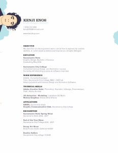
Thanks for these recommendations it’s a nice list of resume designs. Kenji did especially a great job with his resume.
Pingback: Questions to Ask Before Taking Your First Desk Job in Healthcare | Health Jobs
Pingback: Cover letter, Curriculum Vitae y Résumé: Importante para hacer un currículum en inglés – Goprofe Blog
Pingback: Top 10 Formatting Hacks to Get Your CV Noticed - vukelani Education
Pingback: Les créatifs se déchaînent sur leurs CV - Mode(s) d'Emploi
Pingback: Curriculum: come renderlo originale
I’ve read many of the comments but not all (far far 2 many). With everyone obsessed by ATS systems , how do these CV compare or our they design just for human eyes only ?
That’s a great question, Nigel.
Unless you happen to know which ATS an employer is using and can optimize for it – unlikely – these resumes should be for human eyes only, and you can keep a simpler design/template in parallel for ATS submissions.
Pingback: 👊 How To Regularly Beat Applicant Tracking Systems With Your Resume
Pingback: 😆 Funniest Job Search Tips on Tiktok That Are Too True