Many recruiters prefer one page resumes, so use yours most effectively.
The One Page Resume Portfolio

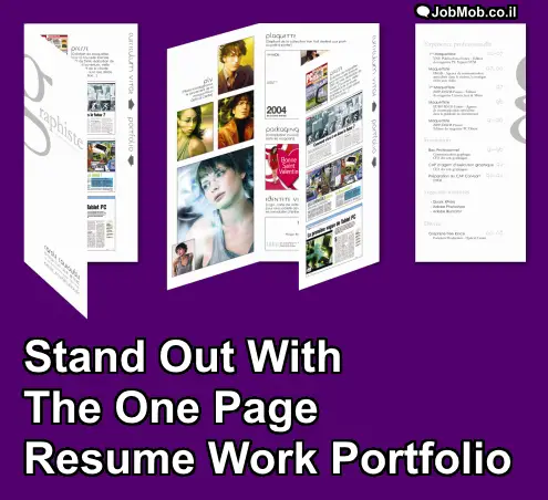
The one page resume portfolio is a 6-panel pamphlet that shows your resume when folded and your work portfolio when unfolded.
If your profession doesn't typically have a portfolio – like most professions – read this first before continuing:
Work Portfolios: The Best Job Interview Tool You’re Not Using (it will open in a new tab/window)
How does it work?
The above image of a French print designer‘s resume portfolio shows 3 different views. From left to right:
- Front view of the resume portfolio, slightly open. You can see the designer's logo and contact information. Notice the vertical bar on the right side of the inner panel, where the text reads “curriculum vitae” with a right arrow and “portfolio” with a left arrow pointing inside.
- Partially-open view of the portfolio. If you followed the left arrow and continued unfolding, this is what you'd see before you're done. The panel with the arrow bar folds outwards, meaning that there's actually more room for portfolio highlights inside.
- Resume details. Following the right arrow will have you flip over the pamphlet, leading to the actual resume content.
Is it right for you?
Cons
- Somewhat complicated design is time-consuming to update or customize
- If you aren't careful and fold it unevenly, look sloppy right away
- May require costly color laser-printing on thick paper for best effect
Pros
- More space to communicate and brand yourself
- Design pun: lets you describe your skills while demonstrating them
- Very memorable, especially when done well
- Partially-folded, it can stand on its own, and left to be noticed on desks or tables
Best Practices
The front panel should contain your personal logo or monogram and contact information at a glance.
(Don't have a logo? See A Visual Guide: Personal Logo Design Tips For Non-Designers)
An attractive image that continues off one panel will encourage the reader to unfold until they can see the entire image. Above, the French designer used that effect to lure the reader to see both resume-related panels together.
The 2 configurations that work best are the pictured 4:2 portfolio to resume panel ratio with arrow bar and the 3:3 “resume-outside portfolio-inside” ratio.
You need a history of school, volunteering or work projects before you use this design. Substituting with content that isn't yours but that you're “capable of creating” defeats the purpose and looks amateurish.
Don't send your one page resume portfolio over email or the Web; it works best live when people can hold it and unfold it, like in interviews or at professional gatherings and networking events.
If you're planning to leave the resume portfolio on display e.g. in a meeting room, the front panel should be particularly eye-catching to make people want to pick it up and open it.
Use the resume portfolio to complement your “full” design portfolio whether physical or digital. For the former, you might consider a sentence about what else not pictured is in your portfolio. For the latter, give all pertinent links.
Conclusion
Great design is the best combination of trade-offs for a certain context. If you use it wisely, the one page resume portfolio could be a valuable tool in your hunt for new design jobs.
What's your take
Why would you/wouldn't you use this technique? Tell us in the comments.
A version of this article appeared on Jacob Cass's wonderful Just Creative blog.
Subscribe to JobMob via RSS or email and follow me on Twitter for more ideas on how to rethink your resume.
Pingback: Creatief Solliciteren 2.0. De flyer CV! | JobMob | #Solliciteren #Netwerken # Social Media | Scoop.it
Pingback: Creatief Solliciteren 2.0. De flyer CV! | JobMo...
Pingback: Work Portfolios: The Best Job Interview Tool You're Not Using
Pingback: 🎸 365 Top Tips to Rock Your Job Search Every Day of 2020