Which is your favorite?
Well over 7 years since JobMob was created and it still has the same logo and branding. Time for a refresh!
The guys over at Emske have begun working on some new logo ideas and I'd love to hear what you think.
Below are the 3 concepts they've imagined so far, each one accompanied with a short description. Browse them all and then vote in the poll at the bottom.
If you have any suggestions, feedback or would just like to explain your choice to me and Emske's designers, that would be great! Leave a comment for that.
Concept 1
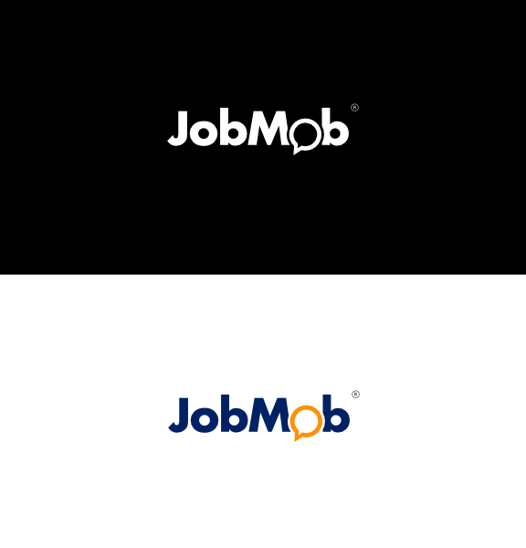
Description
In this logo concept, we tried to keep the bubble from the current JobMob logo. Why? Because we think that you have a strong brand and a lot of people associate JobMob with these comment bubbles, and creating something 100% different is not good move.
In this design our main assumptions are: simplicity, professionalism, reference to the current logo and little dose of humour. The logo is simple with the bubble being ‘mobbed' between the “M” and “b” letters.
Concept 2
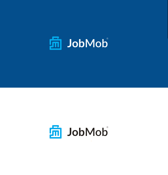
Description
This second logo leaves a more professional impression while still having a bit of humour, as shown by rounded corners in the whole design. The suitcase implies a connection to jobs and work.
Concept 3
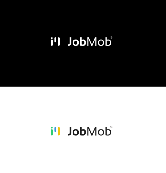
Description
This last logo design is the most simple logo of the group, with a sign [Jacob: that's designer parlance for a symbol] before JobMob.
The sign that we have created has 3 elements and a dot which makes 4 :). We wanted to create a simple sign yet with a meaningful message to JobMob users: those 3 elements are combined letters ‘j' and ‘m' while the entire sign refers to the crowd, because the first element also resembles a person.
Have your say!
Which logo concept do you like best?
- Concept 1 - the comment bubble logo (66%, 105 Votes)
- Concept 2 - the suitcase logo (25%, 39 Votes)
- Concept 3 - the crowd logo (9%, 14 Votes)
Total Voters: 158
Voting has now closed.
Thank you for your help and thanks to everyone over at Emske 🙂
none of the above? Not to hurt anyone, but how about a different 2 and 3? They simply don’t work for me at all. In #2, the suitcase is clear but not the clutter in the middle which keeps on making me frustrated with the teeth. But if you’ve already spent your budget, I guess number one is ok. But I would get another 2 and 3 evolutions from your current logo.
josh- thanks for the feedback
One vote per IP address? Right now I am behind a NAT in a co-working space, so someone voted for the IP already 🙂
I didn’t see the suitcase in the 2nd logo. In the third logo, I was trying to read it as i’l jobmob or something…like i’ll or ‘lil…weird. The simplicity of logo 1 was nice and I like the comment bubble too.
Jan- It might but I don’t think so, the poll plugin only mentions cookies to limit multiple votes. So I think it’s a bug in the the poll plugin; you probably already voted in the poll in the sidebar with the same browser. Test my theory with a different browser.
I like your current logo with the comment bubbles representing the letter “o”. The first option deletes one of the bubbles but does not add anything to your brand. Logos two and three have symbols before JobMob and I believe are difficult for some people to figure out.
If you want an updated logo, I suggest changing the colors or remove the fill colors from the letters. You have a known brand. Sometimes when companies change their logos it does not work in their favor. Can you think of any? Jacob, the bottom line is listen to your instincts. Imagine that you are in the future looking back at this decision, would you want a rebrand or know that you initial concept still conveys your message and is easily recognizable?
I voted for the first but why not use both bubbles, as you have now, to represent a conversation/forum?
2 and 3 are not showing.
Sorry, took awhile to come up. Now they are showing.
I will go for concept no. 1 please.
Regards.
L K Chaawla
PeggySu- thanks for your feedback
Avi- it’s true, not every logo refresh works out for the best, but nothing’s set in stone. If the new logo doesn’t work, I can just change it again. Either way, I don’t expect this logo to last 7 years before the next edition, although you never know. There’s no question a change is needed though. The current logo was current 7 years ago, and it has limitations I can no longer live with for the growth of the site and the brand.
Sharon- a few people have suggested it, and considering how the vote has gone, that’s something I’ll take a look at next.
L K- thanks for sharing
Number 2 looks like a garbage can, and number three looks like they were writing i’ll and for got an l.
Voted for #1.
#2: did nothing for me.
#3: very confusing “sign” for multiple reasons, but I’ll state the obvious: the first element is not a J, it’s a lowercase I, period. No amount of design jargon will make it anything else. Given that, it looked to me like the letters “il” – the TLD abbreviation for Israel, which makes sense in context of who you are, Jacob, but not in the context of the logo. And the third (middle) element is extraneous in that context, which makes it even more confusing. So, no.
And with all due respect to designers, rounded corners do not “show humour.” I suppose, if you equate “less square” in terms of design to “less square” as a human being, MAYBE there’s a leap to be made to rounded=more humourous/fun, but I might be too out of shape to make that leap.
Hi Jacob, Still like #1 the best and found some merit in the comment above that talks about conversation and two bubbles. I think the lack of the shadow on the existing logo makes #1 look fresh while still conveying the image.
Sorry Jacob, but I don’t love any of them. I am not convinced that any one of them is a significant improvement over what you have, although the third one is the most “modern.” I would send them back to the drawing board for something that will stand out more. I think the addition of a “sign” is good because it will be a shorthand that will identify your brand as you continue to grow.
B’hatzlacha! (by the way, I am an atzmai now and not looking for a job, but looking for clients. I am My Tech Tutor (050-7725767) and I help people to use technology (phones, tablets, computers, etc.) Perhaps we could talk about a collaboration. What I do helps people become more employable… Chag Sameach! Bryna Lee
Robin- funniest comment in the thread. Thanks!
Yiftach- thanks for such a detailed comment
Julie- I’m also now curious to see a double-bubble version, thanks for that
Bryna- that’s ok! Appreciate you being so frank, and behatzlacha with your new business. We’ll talk.